Local Data Projections
Vaccine Information
Charts
Note: These graphs are now only updated 2-3 times per week instead of daily.
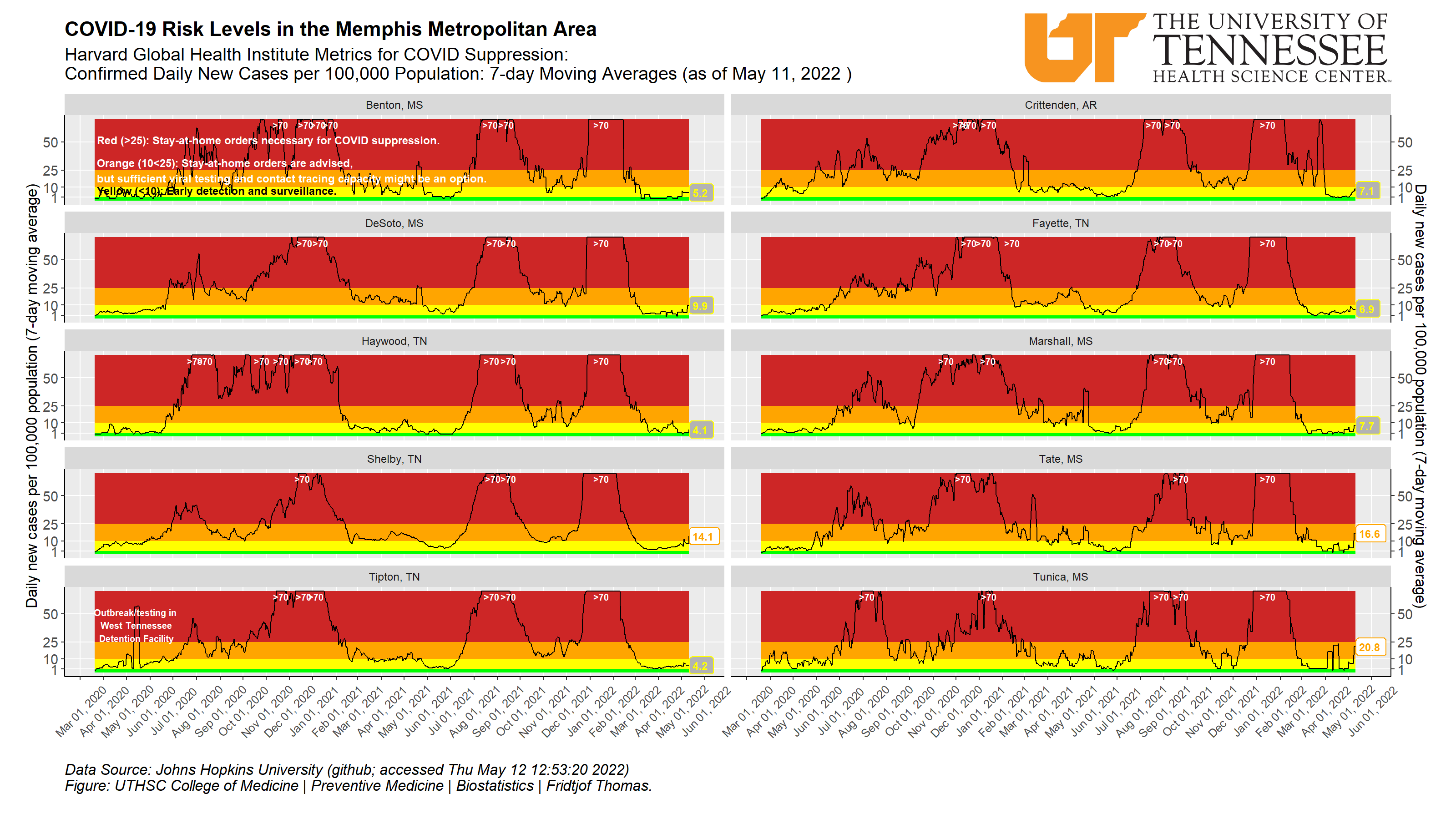
Daily new cases per 100,000 population (averaged over past 7 days) tells us about how actively the virus is spreading in our area. The coloring is based on the Harvard Global Health Institute Key Metrics for COVID Suppression, published July 1, 2020.
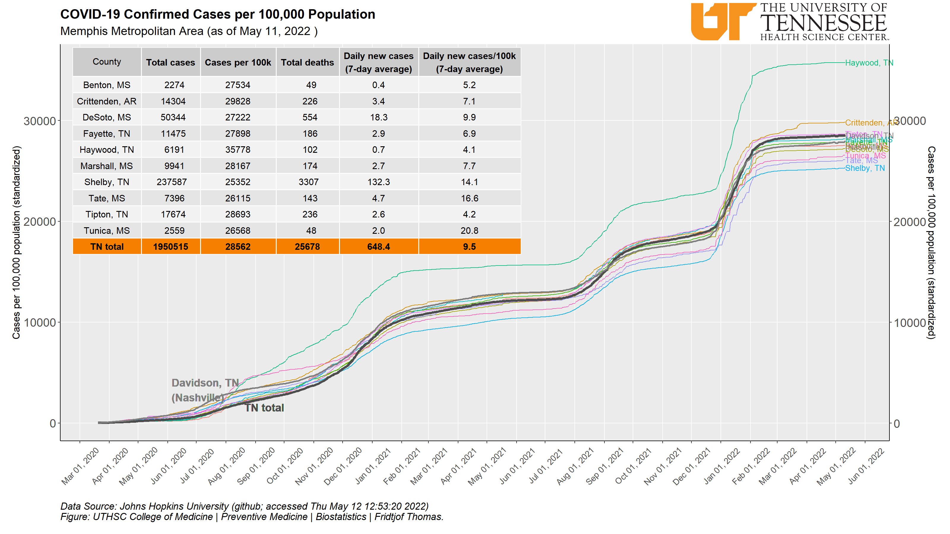
This table shows the total number of people who have tested positive for the coronavirus (confirmed cases). It also shows how many new cases have been found in the last 7 days. It is easier to compare the different counties when computing the number of cases per 100,000 people (column Cases per 100k). The numbers in that column tell us what we would have observed if all counties would have the same number of people – 100,000. These standardized numbers are shown in the figure as lines that climb upwards as the virus spreads in our area. What we can see is that there are differences in how widely spread the infection is in the different counties: if a line is higher, the infection is more common in that county. Tipton County, had a huge jump on May 11 due to the detection of many infected people in the West Tennessee Detention Facility. Viral spread is very common in facilities where social distancing is not possible.
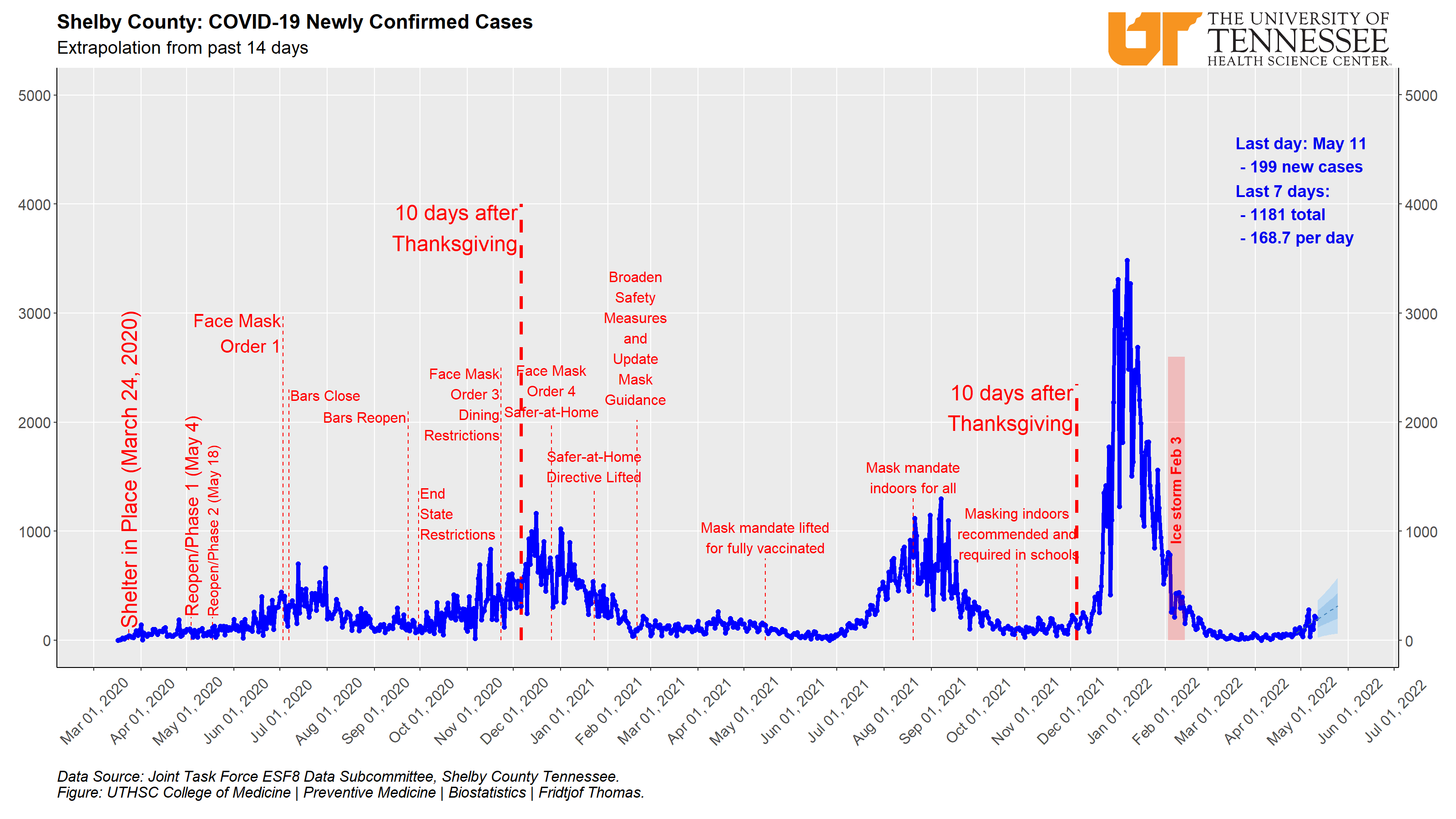
The blue solid line shows the number of new cases every day in Shelby County. On March 24 (see dashed red line) people were asked to stay at home as much as possible (Shelter in Place ordinance) to avoid getting the virus themselves or passing it on to others. When one gets the virus, it will take some days until that person starts feeling sick and will be tested: we believe it takes 5-9 days in most cases. We show a line 9 days after March 24, because we believe that cases after that date got the virus after the Shelter in Place order. Shelby County started to “reopen” on May 4 (Phase 1 of the plan followed by Phase 2 on May 18). The red line across the blue one shows moving averages based on the past 7 days. This is a way to remove some of the day-to-day changes over time and makes it easier to follow the development over time. The dashed line to the right with a darker and a lighter shaded area extends into the future and shows what the data from the past 14 days “suggest” as a development for the next 14 days.
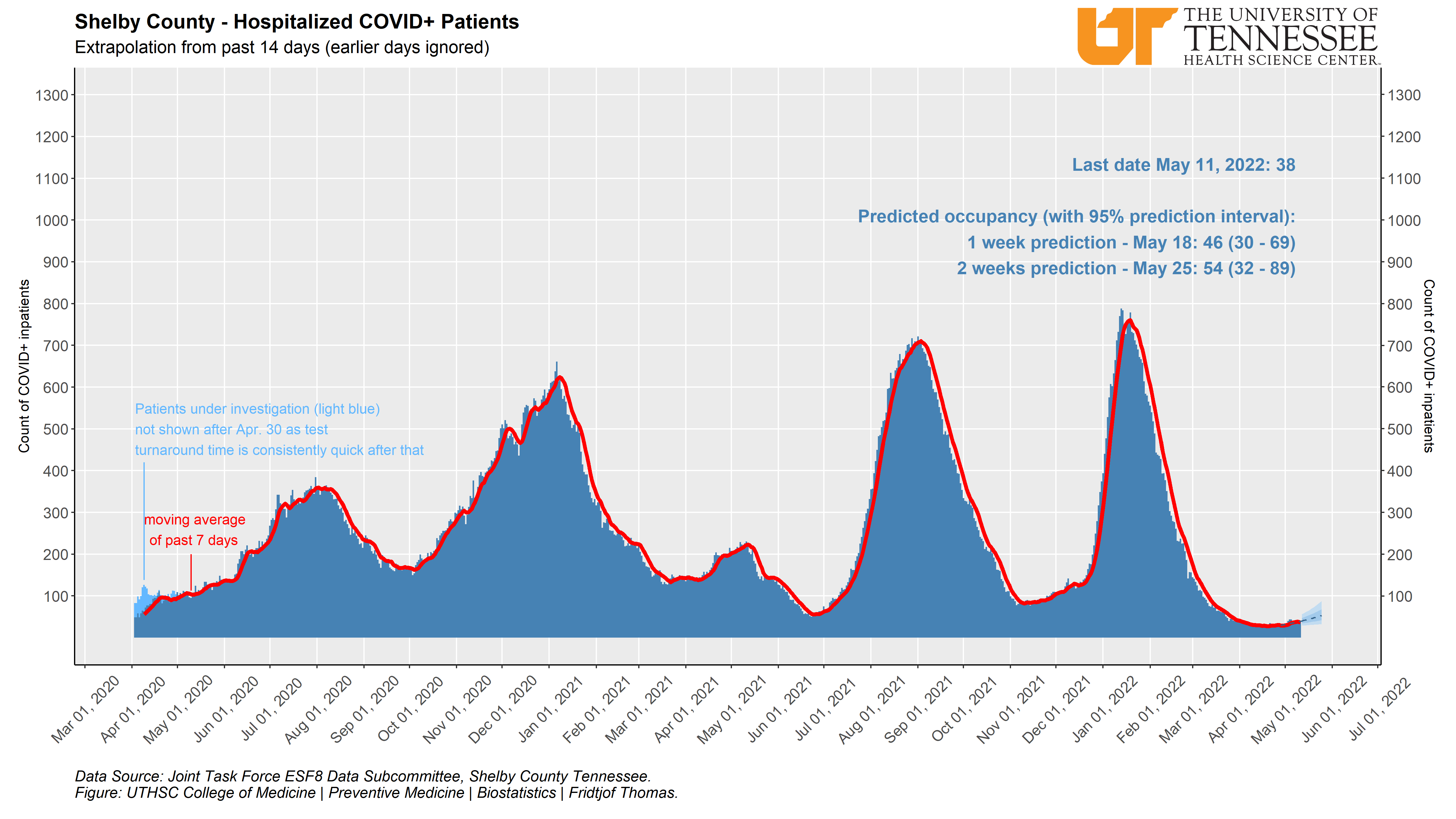
All people who get hospitalized because of the coronavirus are very sick. It is very important that a hospital has the capacity to take care of them (i.e. enough beds or ventilators). The figure shows how many people are in any of our hospitals because of a coronavirus infection (dark blue bars). The hospitals and the Shelby County Health Department are also reporting the number of people “under investigation for the virus”. When a hospital takes a COVID-19 test, the patient is “under investigation” until the test result is completed. Some tests are done because the patient has symptoms or has been in contact with someone who has the virus. Other tests are done to make sure that the patient is free of the virus – for example, a patient needs to test free of the virus to be admitted into a rehabilitation facility. All these patients are “under investigation” until their test result is known. Only some of these patients will turn out to have the virus. The estimate of the persons who may have the virus from those who are under investigation is seen in the light blue bars (not included after April 30 because test results are now coming back soon after the test). The red line across the bars shows moving averages based on the past 7 days. This is a way to remove some of the day-to-day changes over time and make it easier to follow the development over time. The dashed line to the right with a darker and a lighter shaded area extends into the future and shows what the data from the past 14 days “suggest” as a development for the next 14 days.
Archive
Data maps that have not been updated in over 90 days have been moved to this archived section. If these maps are updated in the future, they will be restored to the top section.
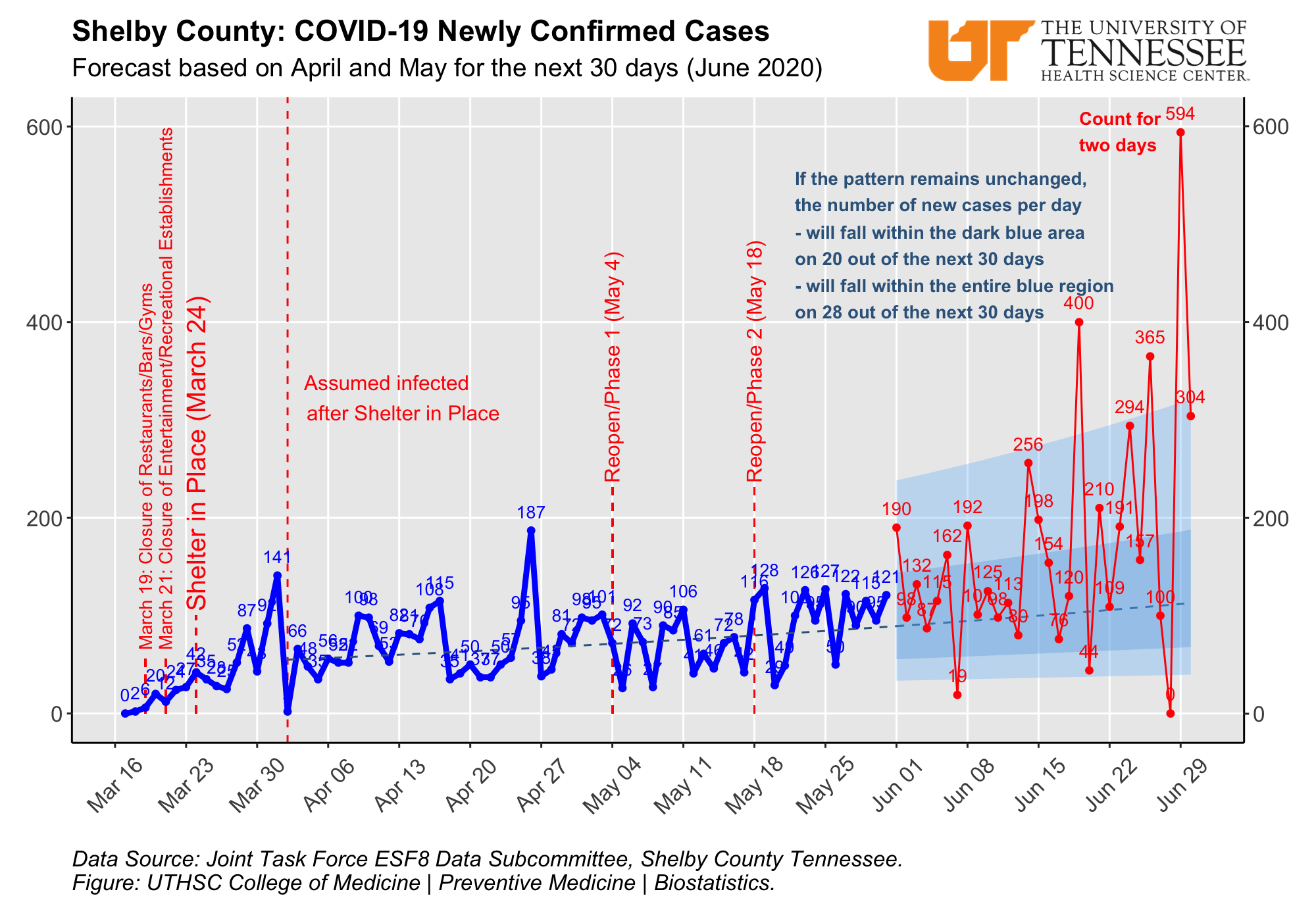
The blue solid line shows the number of new cases every day in Shelby County, see the description for the figure above this one. But instead of updating the forecasts every day, all data from April and May is used to forecast the newly confirmed cases in June. That forecast is unchanged and the red dots in June are the new COVID-19 cases that have been observed after May 31. A line placed 9 days after Memorial Day (May 25) shows where we believe that these people have been infected on or after Memorial Day. The blue shaded area is a prediction of the future cases and helps us see if the virus is spreading more rapidly in June compared to April and May (with Shelter in Place and early phases of reopening).
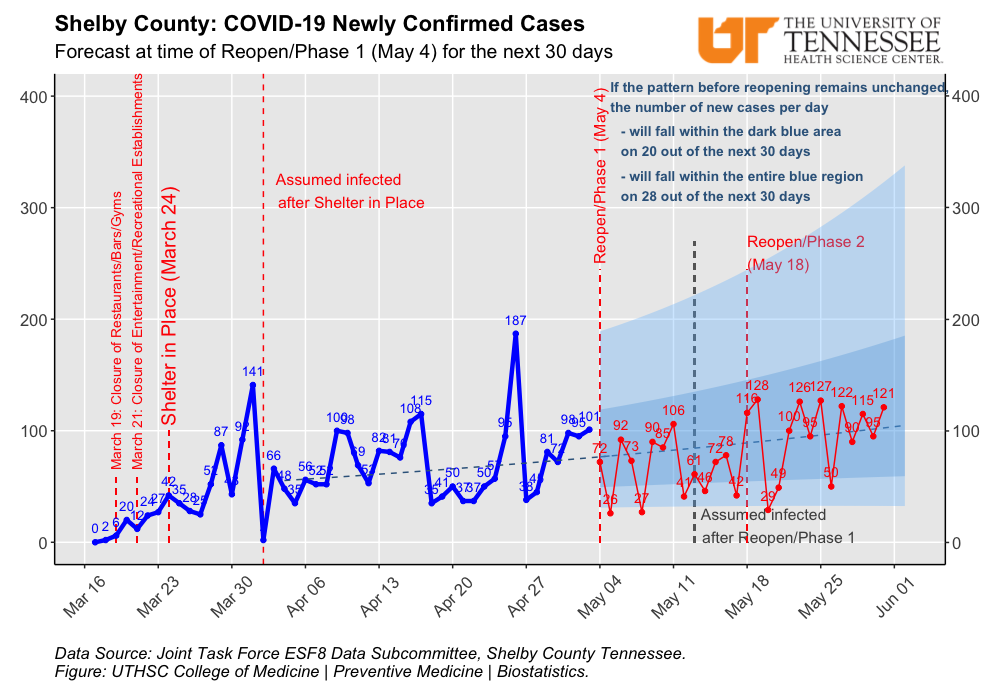
This figure shows that the number of newly detected cases in Shelby County in May was just as expected based on what we had seen before reopening on May 4 (Phase 1). The blue solid line shows the number of new cases every day in Shelby County. On March 24 (see dashed red line) people were asked to stay at home as much as possible (Shelter in Place ordinance) to avoid getting the virus themselves or passing it on to others. When one gets the virus, it will take some days until that person starts feeling sick and will be tested: we believe it takes 5-9 days in most cases. We show a line 9 days after March 24, because we believe that cases after that date got the virus after the Shelter in Place order. Shelby County started to “reopen” on May 4 (Phase 1 of the plan followed by Phase 2 on May 18). The red dots are the new COVID-19 cases that have been observed after the reopening started. A line placed 9 days after the reopening date shows where we believe that these people have been infected after reopening. The blue shaded area is a prediction of the cases in May based on what we had observed in April after Shelter in Place and before reopening. Because the red dots for May are all within the predicted range, it looks like that our behavior changes following reopening Phase 1 did not lead to many additional virus infections that resulted in new.
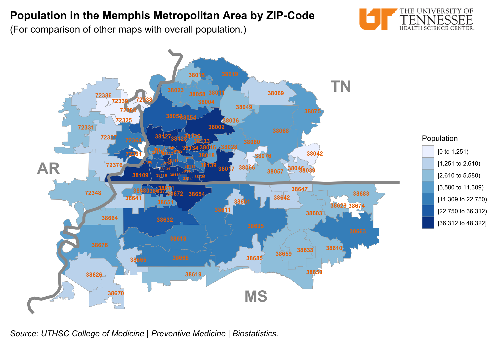
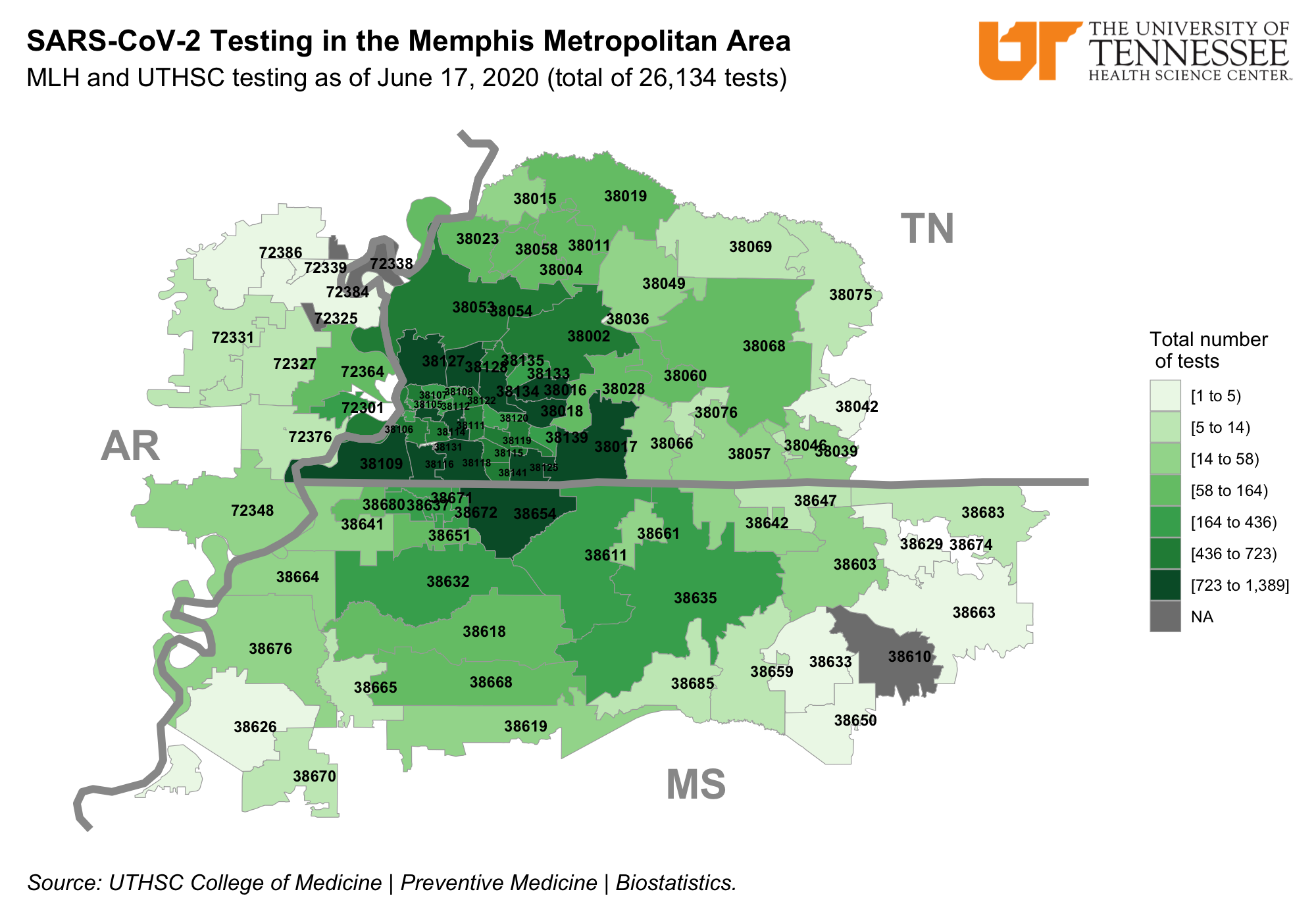
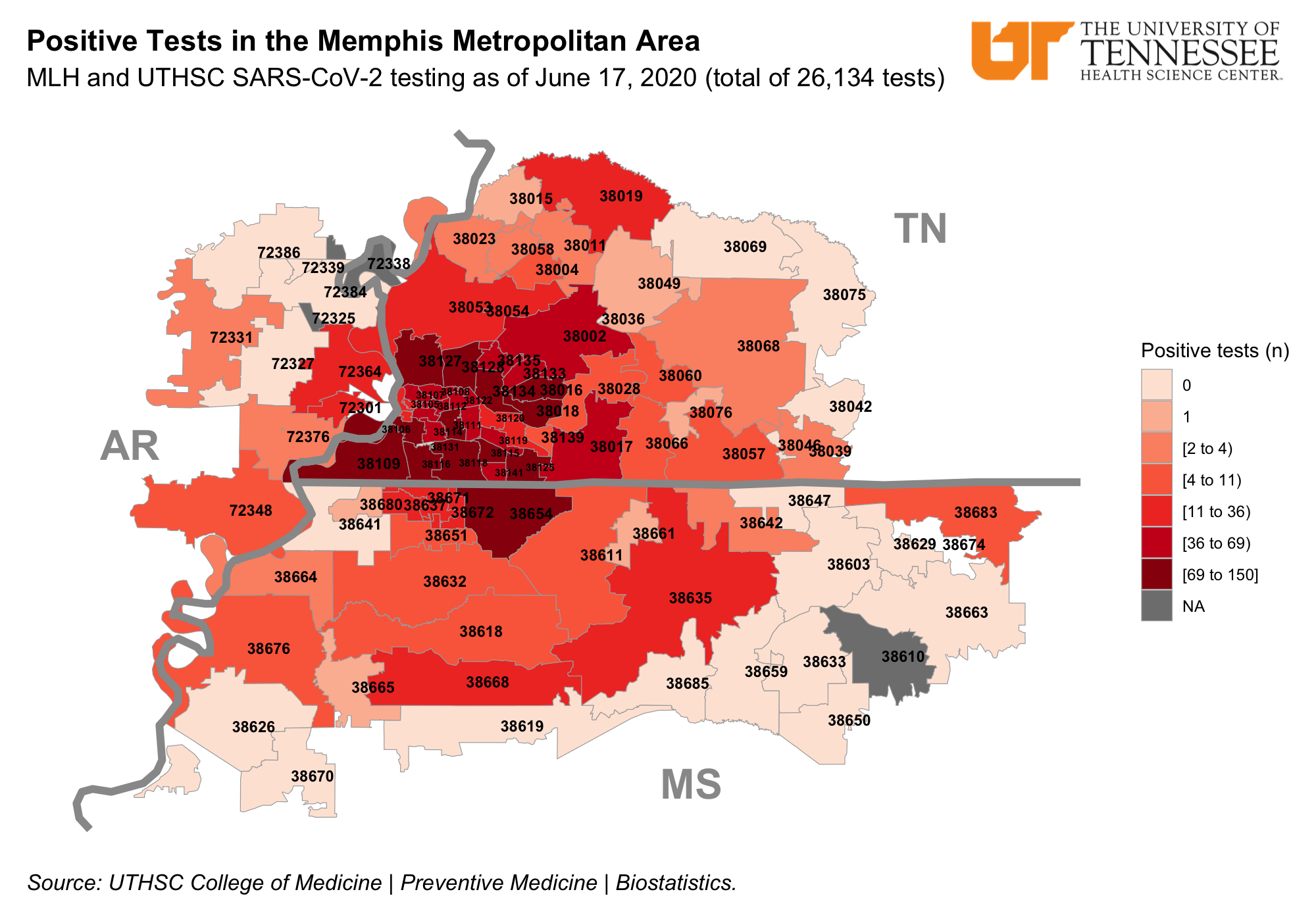
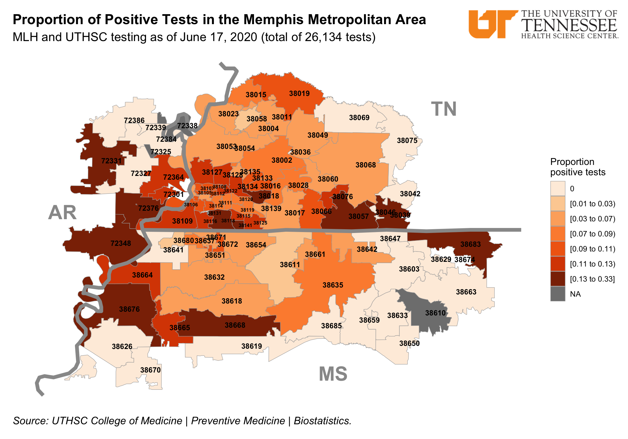
Testing for the virus is important. Methodist Le Bonheur Healthcare (MLH) and UTHSC are testing many people. The above maps show the ZIP codes of the Memphis Metropolitan Area, how many tests have been done for people that live in these areas, and how many tests turned out positive (confirmed cases). These maps can show where people live that have the virus, but also show where more testing is needed. We are using what we know about ZIP codes and the population in these ZIP codes to understand where people need more help. Testing sites in the community have been set up to make it easier for people to get tested.